
Concrete, rubber, full spectrum lamp and electrical fittings

Sewed plastic sheet, pencil and painting on paper

numeric print, air brush

Welded steel, plastic sheet, light

photographie collée, crayon et peinture en spray sur papier

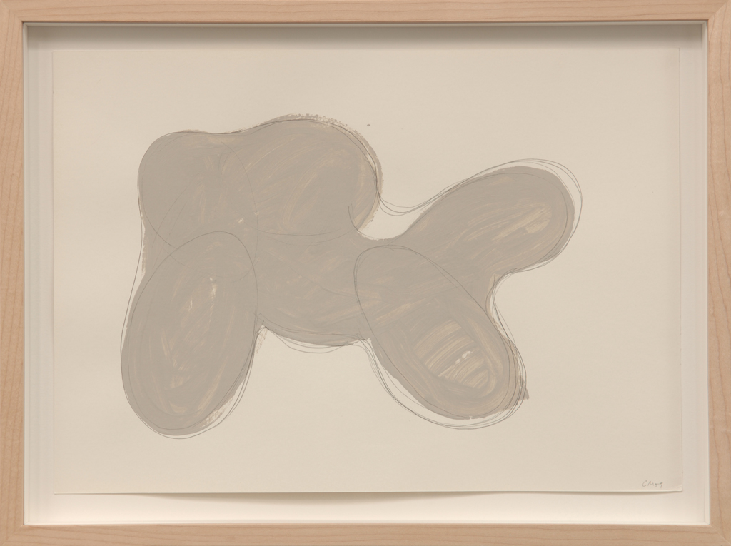
Pencil and painting on paper

numeric print on paper, air brush, bulldogs clips

numeric print on paper

Pencil and painting on paper

Mirrored Perspex, bulldog clip

concrete, black ceramic tiles, steel tube, clamps, perspex, rubber

air brush

concrete, black ceramic tiles, steel tube, clamps, perspex, rubber

Digital print on paper
 2.jpg)
Concrete, black ceramic tiles, aluminium and steel tube, clamps, perspex, rubber

photographs, wood

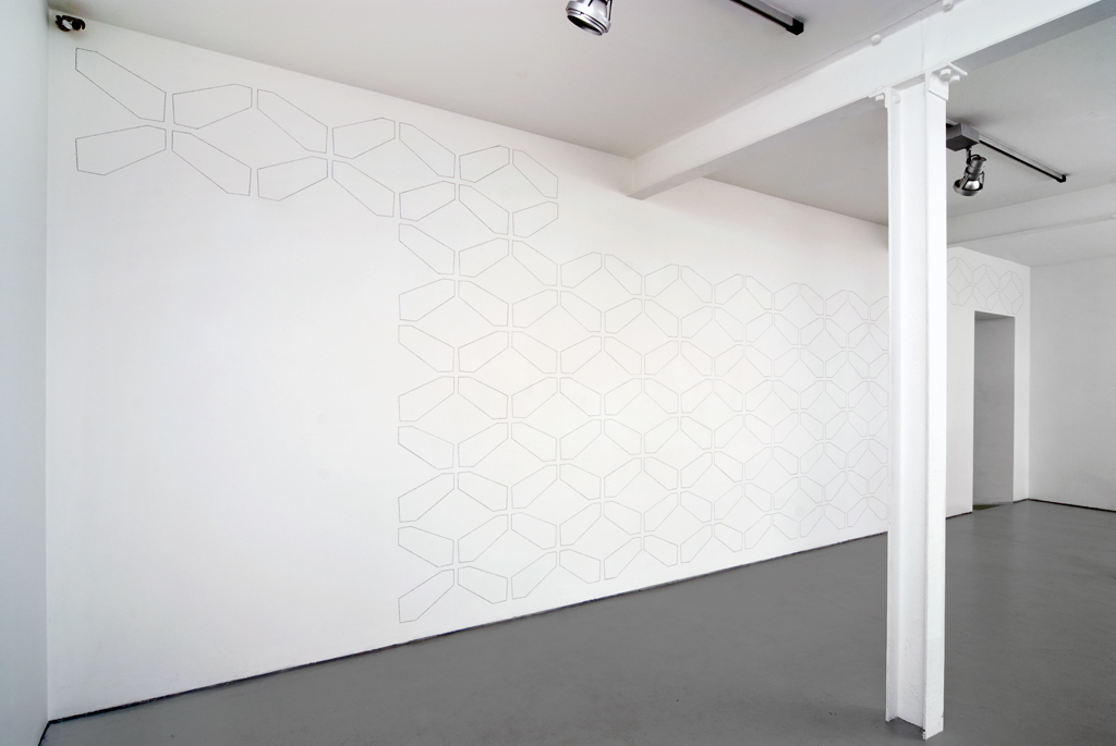
pencil on white painted wall

Pencil and painting on paper
Through A Glass Darkly
By Zoë Gray
The work of Charles Mason resides firmly in the realm of sculpture. Even when presenting wall drawings or photographs, his emphasis is on the delineation of an object in space. Balance, weight, and material are key in Mason’s work, which insists on its own physicality. During a studio visit to see his most recent sculptures, the artist confided with undisguised glee “they’re almost impossible to photograph, you know”. The works in question – Stay, Dummy and Stepping Lightly (all 2009) – are indeed troublesome to the viewer, and even to their maker, who claims not to be able to remember exactly how they look once he is away from them. Each incorporates a large, single sheet of translucent, dark grey Perspex. This is not the first time Mason has used such material on this scale, in fact his 2008 piece In the loop employs just such a sheet to divide, support and reflect a serpentine form of hollow concrete. Like Stay and Dummy, it hovers between the playful and unnerving, its structure of raw scaffolding padded with charcoal grey polyurethane foam at once tempting us as if into a playground, and repelling us like the warning signs on a building site. The materials that Mason employs here could indeed be lifted directly from a construction site, perhaps from a shop refit or apartment renovation. In addition to the Perspex and the scaffolding (which has appeared frequently in his work since 2001), these new pieces feature industrial-chic bolts with shiny domed heads, foam, concrete, and broken tiles. This Arte Povera for the 21st century, emerging – as did the original movement – in a moment of financial crisis and political uncertainty, uses materials that reference our built environment and are at once familiar and removed.
Mason’s earlier works often adapted found pieces of furniture, with table frames and chair-backs reappearing frequently. As if coming to the realization that his materials could act autonomously and did not need to be based upon some existing, external structure, the ‘made’ element of his work has grown. His riffing on domestic objects has shifted into a more architectural framework, yet the reference to human scale is still discernible and the works are clearly conceived – and designed to be experienced – in relation to a person moving around them. The artist has spoken of his own disquiet when faced with his recent constructions. Their imposing sheets of dark Perspex refer obliquely to our lives lived increasingly through a screen. The articulated and curving forms of Stay and Dummy can be contemplated through this highly industrialized material, a plastic made from gallons of oil that rebuffs us like a riot shield, shows us our shallow reflection framed within the work, distorts our perception of reality and engenders a very particular way of looking.
In the tradition of Minimalist Sculpture, the only colour in Mason’s works come from their composite materials, the absence of added colour emphasizing their textures. Mason is keenly aware of the way in which the eye moves across a surface, and has covered elements of all three of these sculptures in monochrome mosaics composed of broken tiles, as a way to further dislocate the gaze from any one point of focus. The fragmented tiles complicate the smooth surface, turning it into a jagged patchwork of shapes that reflect light in all directions. Unlike the Perspex, however, this material brings with it a whiff of kitsch that Mason employs with a knowing wink to civic sculpture, the designs of Gaudi, or even crazy paving and botched DIY. In fact, Mason started using this tiled finish after a visit in 2005 to the Maison Picassiette in Chartres, designed by Raymond Isidore, the epitome of naïve architecture.
In several pieces, Mason exacerbates the confusion between soft and hard, not only through the finishes employed but also through their apparently gravity defying forms. Whilst in Stay and Dummy the support framework becomes a pronounced part of the work itself, in Stepping Lightly our curiosity is aroused by its seeming impossible structure: balancing flamingo-like on one spindly leg, a wheel at its base, this coquettish piece admires its reflection in the wall-mounted Perspex sheet, casually draping its inflexible concrete tube against the floor. However, nowhere in Mason’s oeuvre is this apparent contradiction between ‘truth to materials’ and material trickery clearer than in Rock (2009). Though made of concrete and named after the most immobile of natural forms, when touched it gently rocks (note the pun) back and forth. Taking inspiration from sources as diverse as Le Corbusier’s designs for Chandigarh and the concrete ‘rocks’ that dot the enclosures of unfortunate animals in the zoo, this strange, pod-like form evokes a quasi-organic architecture. Streamlined in shape, smooth on the inside and rough on the outside, its form and texture reveal the process of its making. Carved first in polystyrene, it was covered with a skin upon which concrete was layered in a time-consuming technique that built up the surface like an eggshell. Harking back to his earlier drawings of interior spaces drawn on the exteriors of containers and his virtual murals sketched on the facades of buildings (both series Untitled, 2005), this work eloquently illustrates Mason’s desire to reveal hidden structure within form. “There is so much material under the surface of a sculpture,” he explained, “that I wanted the surface itself to be the structure”.
Rock continues Mason’s aforementioned practice of working on a scale closely linked to that of the human body, but here the invitation to climb inside is stronger than ever. A daylight bulb shines through milky white, opaque Perspex in one of the two ‘arteries’, flooding the interior. This is a development following Mason’s 2009 Model for Mood Altering Public Sculpture (SAD version), a work imaging a structure in public space that might – in everyday parlance – ‘give something back’ to its environment and audience. In both Model and Rock the literal projection of light counteracts the usual need for our mental ‘projection’ onto the work. In Rock, the experience that this provides is an ethereal encounter with an interior, lunar landscape, a journey through a glass darkly into the heart of sculpture.